
10th Lecture — Abstract
Colour Theory
On colour and light-dark
Colour is just the feeling of colour. Therefore, the fundamental law of the science of colour is that by which the organ of vision operates. All forms of colour formation, mixing and sensation can and must be explained by this “overriding principle.”
The organ of vision works like a computer. The computational tasks (brain function) and the product (sensation) are standardised. Adaptation to this standardised process happens in data input (eye).
The input unit is programmed to transform and correct the input information. It is adapted to the standardised manoeuvring space of the computer and the output unit. The sensing (sensing) mechanism in the output unit has a very limited range. When the stimulus is intensified beyond a certain level, this does not result in an even stronger sensation. On the other hand, the organ of vision has an incredible ability to adapt. Our eyes are able to compensate for extreme light contrasts. But they certainly take time to do so.
No matter what the data was, the programmes can only calculate what they were programmed to calculate. And the programmes are tuned to the capabilities of the output unit. So the quantities and qualities of colour sensations are not directly dependent on the colour stimuli. The eye has to adjust large fluctuations in light quality to the sensitivity range of the organ of vision. The input data are adjusted in such a way as to preserve as much room as possible for upward and downward movement, i.e. for highlights and shadows. The adjustment programmes are known as adjustment, overexposure and simultaneous contrast.
Quantitative adjustment happens first mechanically, as with a kind of aperture. If, under extreme conditions, the aperture cannot be made more opaque or subtractive, a chemical mechanism takes place. Then the sensitivity itself changes. The system works in a similar way for different qualities of light, except that the sensitivity range is now adjusted separately for different beam intensities.
A scene may comprise different levels of intensity, and the eye adapts to the average value. This mean value becomes the norm, and the whole field of vision is seen from the point of view of this norm (the mean value of the light and colour intensities). We can also adapt to particular parts of the field of vision, for example the shaded part. As the eye adapts, it can clearly distinguish previously obscured details.
Together, these are called the adaptation of the eye. This is very similar to photography when we talk about the zonal system, or that the light meter “thinks” in medium grey.
Axiomatic foundations of the colour world
Colours and basic colours
We speak of primary colours in relation to the three types of cones in the human eye. We call the three basic faculties of colour perception primary colours. These are: violet-blue primary colour, green primary colour and orange-red primary colour. There is latent colour perception material in the eye that can be activated between a minimum and a maximum, i.e. between 0 and 100 per cent. The intensity of the irradiance in the spectral range determines how much of the potential will actually be activated. And now the question arises as to how many extreme colour perceptions are actually possible. From Figure 1 it is clear that there are eight such perceptions, and these eight basic colour perceptions are called the basic colours. So there are three primary colours and eight basic colours. The primary colours are the three basic modalities of colour perception, and the basic colours are the characteristic perceptual qualities. We need to have these at our disposal if we are to build up a complete system of mixtures with the material means of colour. Leonardo argued that there are eight basic colours which cannot be mixed from other colours. We can say that the primary colours are the axioms of colour perception, and the basic colours are the definitions.

Fig. 1: Colours are referred to as the three basic faculties of colour perception. These are: the violet-blue primary colour, the green primary colour and the orange-red primary colour. There is colour perception material latent in the eye which can be activated between a minimum and a maximum, i.e. between 0 and 100 per cent. The intensity of the irradiance in the spectral range determines how much of the potential will actually be activated.
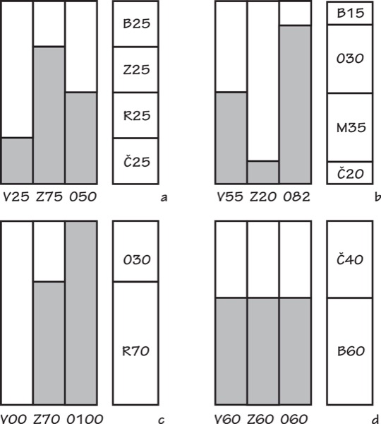
Fig. 2: The principle of how the eye works. In the left rectangle we see the eye’s potentials for the ability to perceive colours, which we call primaries. In the right rectangle we see the fractional amounts of the primary colours that result (R – yellow, M – magenta red, C – cyan blue, V – violet blue, Z – green, O – orange red, B – white, C – black)
The principle of how the eye works can be seen in Figure 2.
In the left rectangle we see the eye’s potentials for the ability to perceive colours, which we call primary colours. In the right rectangle, we see the partial quantities of the primary colours that have been produced. In each column of the left rectangle we can practically read off what proportion (in percentage) of the potential of each colour has been used. In the right-hand rectangle we can see what proportion (in percentage) each base colour represents of a given colour tone. This is also a basic law of colour science. In the left rectangle we plot the potentials of the primary colours, and in the right rectangle we plot the fractional values of the primary colours. The potentials of the primary colours correspond to the code. Whatever the values in the left rectangle, the right column is always filled:
equal amounts of the potentials of all three primary colours give white as the base colour;
equal amounts of the corresponding potentials of the two primary colours give a yellow (R), magenta red (M) or cyan blue (C) base colour;
the exhausted potential of only one primary colour gives violet blue (V), green (Z) or orange red (O) as the base colour;
difference between the maximum available potential and the maximum possible potential gives a black base colour;
Colour modalities
Psychologists divide the totality of concrete colour phenomena into three groups:
Substantially conditioned phenomena; that is, phenomena that are predominantly dependent on a colored substance or dye.
Lighting-dependent colour phenomena; these are phenomena which depend primarily on the lighting and its circumstances.
Subjectively conditioned colour phenomena; these are phenomena in which psychic integration or complementation with the sensations of the other senses is decisive.
Coloured light and material colours
When coloured substances are mixed, we see only the residues of light that are reflected by the coloured substances involved in the mixing. Coloured substances are called colours for short. Mixing is a kind of subtraction or subtraction of wave regions, and hence corresponding amounts of light, from white light: a certain amount of light is lost in the substance. As a rule of thumb, mixing two complementary colours should produce black. Usually, however, the materiality of the colour carriers results in a more or less dark grey. The result is therefore a neutral, non-porous (non-chromatic) colour. Substances with colour quality, however, are variegated (chromatic) colours (Figure 3).

Fig. 3: Because of the laws of colour viewing, it is possible to roll a band of spectral colours into a colour circle.
a Each colour is given its opposite complementary colour, i.e. that with which it is complementary to white light.
b The mixing of coloured substances departs in part from this scheme. Mixing is a kind of subtraction or subtraction of wave regions and hence of corresponding amounts of light from white light: a certain amount of light is lost in the substance. As a general rule, mixing two complementary colours should produce black.
Surface colours A colouring agent appears on the surfaces of objects under normal living conditions. In these colours, the distinction between object and lighting is pronounced, so that they appear to us as real or realistic rather than merely fictitious. They have special characteristics: 1. surface colours can always be placed at a relatively precise distance; 2. surface colours represent a relatively solid composition with an opaque surface, which is felt by the eye as a kind of barrier or resistance; 3. surface colours can therefore have any orientation towards the observer; 4. a surface colour reports to us the surface of the object as such in its detailed structure (it has all the curves, it reveals to us the material structure and the roughness of the upper layer as well as the object itself).
In artistic practice, surface colours appear to us in several ways: 1. on the surface itself as an object; 2. on the surface (in a painting) as a property of painted objects; these two appearances are mutually contested; 3. as a property of painting colours, where we perceive colours as objects.
Surface colours are pure colour impressions and appear without objects. For them the distinction between object and illumination is practically impossible. The colour appears to us as a pure homogeneous colour quality, without being able to discern the material structure or background of the colour, which tells us what material the object is made of. Painting colours are just such colour abstractions, because in visible nature colours predominate, and they have their own object meanings. Thus colours have their own meanings, reduced to themselves. Typical representatives are spectral and similar colours. In contrast to surface colours, surface colours always appear to us only in the frontal direction. They appear as flat qualities. Space is not an essential moment for colour, but only for the concrete appearance of colour.
The relationship between surface and surface colours is such that the maximum of one appearance is at the same time the minimum of the other.
In direct relation to the reduction of surface colour to a purely surface colour is the concept of ‘normal lighting’, in connection with the concept of ‘true colour’.
Volumetric colours As soon as a colour is transparent in any way, it takes on a significantly volumetric character, with the result that the purely surface form of the colour gradually disappears. We often have the impression that transparency stands in inverse proportion to volume. The thinner the colourless glass, the less voluminous its character. So the greatest voluminosity of colour is in some intermediate degree of transparency, where it mixes with some degree of still transparent density.
The surface appearance of a colour is incompatible with its voluminous character, because voluminousness is inevitably bound up with transparency, which is incompatible with superficiality.
Formal parameters of colour or colour dimension
The structure of the arrangement of an ideal colour space is a classification of dimensions! Quality signs are quantitative relationships between basic colours.
From the logical relationships between the primary colours follows the ordering of the primary colours. From the logical relations between the primary colours follows the ordering of the colour qualities. The quantitative relations between them are the parameters of the quality. These are arranged so that colour shades with the same visual properties lie on the same transverse faces of the colour body. Since colour harmonies are nothing more than quantity relationships between primary colours, they can be quantified.
Colour tone
The characteristics by which yellow, red and blue are distinguished are called colour tone (a type of variegation or chromaticity; hue, Buntton, Buntwert). Colour tone is the true colour quality, the characteristic that distinguishes colours from each other by their variegation. It is the ratio of the fractional quantities of variegated primary colours. The ratio of the fractional amounts of the non-pigmented colours white and black are the non-pigmented colour shades.
Diversity
The features by which white, grey or black are distinguished are called opacity (a type of opacity or nonchromaticity; Unbuntwert); this is a new parameter. Unboldness is a variable or function of colour tone, and Harald Küppers considers it a special colour dimension.
Colour purity
The characteristics that distinguish, say, a strong orange-yellow from a bright ochre are called colour purity (saturation or degree of variegation or opacity; chroma, Buntheit, Reinheit). Colour purity refers to the amount of variegated (chromatic) quality in a colour shade that is accompanied by a corresponding amount of opacity (nonchromaticity). It is therefore the ratio of the amount of opacity to the amount of variegation.
Specific colour brightness
The characteristics that distinguish light colours from dark colours are called colour brightness (value).
Absolute colour brightness
Pure colours vary in brightness, and we can find the appropriate brightness, tonality, for each of the unvarnished colours.
Relative colour brightness Each colour shade can be brightened or darkened by adding white or black. Such colour shades are called lightness tones or valences. We speak of a tone of lightness in a context in which the primary artistic means of expression of the visual element is lightness, for example in Renaissance and Baroque painting … (tone painting). We speak of a valerian in a context in which the primary artistic means of expression is COLOUR.
Colour systematics and mastering colour space: colour mixing
Rombohedral colour space
In this exercise I will follow the systematics of Harald Küppers. His rhombohedral colour space is the shape of a coloured solid, such as, for example, a coloured sphere. This model is based on the laws of vision, on the practice of painting, where we are dealing with coloured matter, and on printing, when it corresponds to three-colour or seven-colour printing. Moreover, this model corresponds to mixing coloured substances and mixing coloured light at the same time!
If we ignore the solid dimension of the colour body, we speak of a colour circle or colour hexagon. In a colour circle (hexagon), the colours are arranged in such a way that each colour has the greatest similarity to the neighbouring colours (the colours bite each other in the tail). The colour hexagon (circle) is the basis of painting, just as the twelve-tone system is the basis of music.
Vector representation
In physics, a vector is a force that emanates from a point and has a direction. What we see schematically in the table in Figure 1, we will show geometrically here.
The starting point is the basic perception of the colour black. The three vectors representing the three basic colours are derived from this starting point and are of equal length, since the three basic colours are equivalent to each other. For the vectors to be truly equivalent, the angles between them must be equal. So the angles between the vectors are 120° This gives us a planar model in the form of a hexagon. The colour hexagon is an abstracted colour space because it ignores the non-empty dimension. There are six basic colours on its six charcoals. Each point on the surface is clearly defined in terms of the potentials of the primary colours. Its position is determined by the law of the parallelogram of forces. However, in this model we can only obtain the resultant of two vectors instead of three. Therefore, we reduce the angle between the vectors at the origin. They are thus lifted out of the uniform plane and a three-dimensional model is obtained. The transformation allows us to transform the ideal rhombohedral colour space into any three-dimensional shape. When we reduce the angle between them at the origin to 60°, we get a very interesting solid. Its faces are rhombi whose shorter diagonal is equal to the length of the side (edge). These rhombi can therefore be bisected to give two congruent equilateral triangles (see Figures 4 and 5). In this rhombohedron, the odd axis is much longer than the even axes.

Fig. 4:

Fig. 5: The faces of an ideal colour space are rhombi whose shorter diagonal is equal to the length of the side (edge). These rhombi can therefore be halved to give two congruent equilateral triangles. In this rhombohedron, the odd axis is much longer than the even axes.
Red in rhombohedral colour space
From black (sh), the prime vectors are derived. The lines leading from black (sh) to violet blue (V), green (Z) and orange red (O) represent three vectors. As a result, green (Z) and orange red (O) give rise to yellow primary colour (R), orange red (O) and violet blue (V) to magenta red (M) and green (Z) and violet blue (V) to cyan blue (C). The result of all three vectors together is white (B). Of course, white (B) is also the result of yellow (R) and violet blue (V), magenta red (M) and green (Z), and cyan blue (C) and orange red (O) (Figure 6).

Fig. 6: From black (C), the primary colour vectors are derived. The lines leading from black (B) to violet blue (V), green (Z) and orange red (O) represent the three vectors. As a result, green (Z) and orange red (O) give rise to yellow primary colour (R), orange red (O) and violet blue (V) to magenta red (M) and green (Z) and violet blue (V) to cyan blue (C). The result of all three vectors together is white (B). Of course, white (B) is also the result of yellow (R) and violet blue (V), magenta red (M) and green (Z), and cyan blue (C) and orange red (O).
The variegated colours of the rhombohedron’s mantle are arranged so that they blend into a solid axis of colour if the body is rotated around the vertical axis fast enough. This gives the unpolished rock a special meaning. It is also arrived at by making the vectors in the origin bracket each other at 0o angles and so neutralise each other.
All three axes intersect at the centre of the body at an angle of 90o. This absolutely symmetrical arrangement is a feature of the logical order in this solid. The rhombohedral colour space is an ideal space which corresponds very well to the laws of visual perception. But it is still only a representation or a mental model. It combines two systems: the solid linear scale and the variegated hexagon.
Subsystems of the rhombohedron
If you cut a rhombohedron so that the cuts run simultaneously along the solid axis and along two opposing vectors of variegated primaries, it breaks into six equal parts. Each of them is an autonomous subsystem, and together they form an integral rhombohedron. Each part corresponds to six groups of primary colours. The outer face lying opposite a given basic colour is the reference face of that basic colour. Each geometric point of this subsystem therefore lies at the intersection of its four basic colour quantities, thus defining the four corresponding partial quantities.
A rhombohedron can be cut so that it decays into two tetrahedra and an octahedron. These three bodies represent three subsystems: mixing with white, mixing with variegated colours and mixing with black.
Colour dimensions in rhombohedral colour space
Colour tone
Colour shades mixed from certain variegated shades and from certain non-variegated shades lie on the same solids.
The colour cuts lie in pairs on opposite sides of the odd axis. The two triangles of a colour cut together form a parallelogram of colour purity (Figure 7).

Fig. 7: Colour cuts lie in pairs on opposite sides of the non-pure axis. The two triangles of a colour cut together form a parallelogram of colour purity.
The colour shades on the planes of the colour cuts are also arranged systematically (Figures 8, 9 and 10).
Fig. 8: In a colour slice, each colour hue lies at the intersection of the lines of opacity, degree of opacity and brightness.
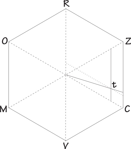
Fig. 9: In a colour circle (hexagon), each colour shade lies at the intersection of the lines of colour tone, degree of opacity and brightness.
Fig. 10: A three-dimensional model of “all” colour cuts in an ideal colour space.
Colour shades of the same opacity lie on the same continua between a given point of opacity on the opacity axis and a point of colour tone. The solid line between, for example, neutral (N) and green (Z) is called the line of equal opacity in this colour cut. Lines parallel to the solid axis are called lines of equal purity because the points on this line are equally varied and equally solid. The further these lines are from the axis of the solid, the greater their colour purity.
We can see that the quality parameters also deal with geometric overdetermination. With three of the four quality planes, each point in colour space is precisely defined. The fourth plane is obtained as a necessary consequence.
Nepurity
In an integrated tetrahedron, all colour shades of the same (in)variegation lie on the intersection plane, which is obtained by connecting with straight lines a point on the non-variegated axis to all points lying on the variegated edge. An example of such a surface is shown in Figure 11.

Fig. 11: In an ideal colour space, all shades of the same (in)variety lie on a cross-sectional plane obtained by connecting a point on the solid axis with all points lying on the ragged edge by straight lines. An example of such a plot is shown in the figure.
Colour purity
How these diversity characters are grouped can be seen in the view in Figure 12.
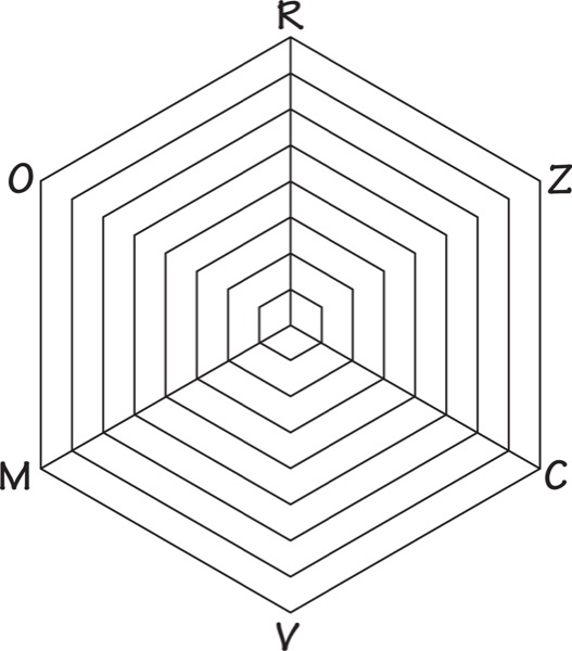
Fig. 12: In an ideal colour space, colour shades of equal purity lie on intersecting faces that are both parallel to the variegated edges and to the solid axis. On the outer face of the same colour purity lie variegated edges.
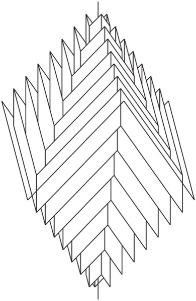
Fig. 13: Three-dimensional model of “all” faces of the same colour purity in an ideal colour space.
In singly integrated tetrahedra, we are dealing with intersecting faces that are simultaneously parallel to the fringes and to the solid axis. On the outer face of the same colour purity lie the variegated edges. The further one moves away from this outer face towards the non-sparse axis, the greater the degree of opacity, until at the maximum possible distance it merges with the non-sparse axis itself.
Here we have a very interesting geometrical transformation. The further we move away from the outermost face (the solid edge) towards the solid axis, the shorter the side of the colour tone of the intersecting faces and the longer the side of the solid.
Colour brightness is a parameter that deviates from the rigid and absolutely symmetric rhombohedron principle. It jumps completely out of order, it runs across the established structures of orderliness.
The brightness surfaces are the intersection surfaces of the individual integrated tetrahedra. Together they form a surface which is “force irregular”. A point on the plane of equal brightness lies at the intersection of the lines of colour tone, opacity and colour purity. The irregular shape of this plane results from the fact that not all primary colours are equally bright. The darkest impure primary colour is violet and the lightest is yellow.
The “complexity” of the concept of brightness may mean that we do not pay enough attention to it. However, from a perceptual point of view, it is brightness that is (potentially) the most important parameter. Because of the unequal brightness of the primary colours, the same geometric distance in colour space does not also represent the same brightness of the colours that we practically perceive. Therefore, the rhombohedral colour space has to be slightly transformed. We need to change the positions of most of the individual primary colours so that the colours lie on the same planes as the non-primary levels, which are perceived as equally bright.
The rhombohedral colour space is organised in such a way that the tone, opacity and purity of colour have a perfectly symmetrical, quantitative arrangement. At the same time, this order does not correspond to what we perceive with our senses. If we reorganize the colour space to suit our perceptions, then the colour tone, the opacity and the purity of colour will no longer be symmetrical with each other.
The Intertextual Effects of Colour
Colours that work together can be in harmony with each other. They can evoke pleasure and joy in the observer. They may be at odds, or even fighting.
No colour is isolated. Every colour is influenced by its colour context. Their visual appearance, and therefore the perception of colour, is the result of a “process of competition” that takes place in the eye, called simultaneous contrast, adaptation or perception. The perception process corresponds to the colour space. Colour shades are unrelated to each other if they have no quantitative or qualitative tuning or similarity. They are unconnected if they do not lie on faces of the same quantity or quality, or if they have no distance between them that can be perceived or geometrically determined. Each point of the colour space lies at the intersection of planes of equal quality or planes of equal quantity. Colours lying on the same intersecting plane agree in one parameter, those lying on the same intersecting plane agree in two parameters. The match may be quantitative, if the potentials of the primary colours or the partial quantities of the primary colours are the same, or it may be aesthetic, if they share a common aesthetic characteristic.
Let us imagine an arbitrary straight line in colour space consisting of points representing a set of colour shades. Let us choose a number of points which lie at certain distances from each other or in a certain sequence. We can say with certainty that the colour shades are strongly linked to each other by rhythm and that they appear interesting to the observer because they share a common structure of orderliness. We say that they are harmoniously tuned.
Colour shades can lie in the same plane in colour space and thus have a two-dimensional relationship. Let us imagine that we choose such colour shades lying on the charcoal faces of an arbitrary regular polygon. What is common to all the colour shades so chosen is that the sum of the primes is the same for all of them (Figure 14).

Fig. 14: Colour shades may lie in the same plane in colour space and thus have a two-dimensional relationship. What is common to all the colour shades lying on the charcoal faces of an arbitrary regular polygon is that the sum of the primes is the same for all of them. This gives an infinite number of colour combinations.
This gives infinitely many colour combinations (example in Figure 15).
Fig. 15: All the colour shades lying on the carbons of any regular polygon have in common that the sum of the primes is the same for all of them. The figure shows an example where the polygon is a triangle.
In colour space, however, we don’t have just one plane of equal sum, but many. In addition, we have planes of equal amount of primary colours and planes of equal amount of primary colours in the integrated tetrahedra and in the white and black tetrahedra; we have planes of equal colour tone, equal opacity, equal colour purity and equal brightness. We perceive as harmonics all colour shades which are rhythmically or symmetrically organised and have a common quality or quantity marker. What the colour sciences call contrast is nothing other than the opposition in one or more signs. The effect of colours is based on what they have in common, on what distinguishes them and on the rhythm of the distances in colour space.
Colour mixing
Additive blending is a direct manipulation because the colour stimulus itself is manipulated. In subtractive blending, however, things happen in another link in the chain, namely the material space. So the modulation occurs indirectly and no longer directly. This is due to absorption in the filter layers. Therefore, the two aspects of mixing are partly divergent. In Harald Küppers’ Colour Body it is presented as an opposite, reciprocal, complementary principle. In additive mixing, the lower four basic colours of the rhombohedron were sufficient, whereas in subtractive mixing we need the upper four. Thus, here we have white as the starting colour instead of the previous black. The three outer faces of the rhombohedron, which meet in black, are the reference faces for additive blending. The three outer faces of the rhombohedron, which meet in white, are the reference faces for subtractive blending. So the reference faces are the same in both cases, except that “we go backwards from the front and forwards from the back” (Figure 16). An example of additive blending is a television set, and an example of subtractive blending is a colour photograph.
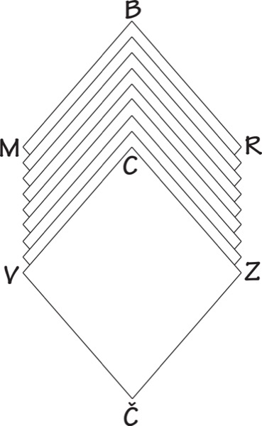
Fig. 16: In Harald Küppers’ Colour Body, subtractive colour mixing is presented as the opposite, reciprocal, complementary principle to additive mixing. The three outer faces of the rhombohedron, which meet in black, are the reference faces for additive blending. The three outer faces of the rhombohedron, which meet in white, are the reference faces for subtractive mixing. So the reference faces are the same in both cases, except that “we go backwards from the front and forwards from the back”.
Integrated blending – the pigment granules absorb some of the coloured light (hence subtraction), but on the other hand, very small granules that are too small to be seen by the naked eye also reflect, which is then transferred to the retina (hence admixture).
Colours can also be mixed optically because the eye has limited discrimination abilities. With eyecups and rods acting as receiving antennae, it is determined how small things we can still see. Practically, it has been found that the eye can only detect a single object up to 1/6th of a millimetre in size. Anything smaller more or less blends in with its surroundings. This is why they can raster print inks in the printing industry.
Because the eye reacts quite slowly, colours are also mixed because of their speed (because of the rapid changes when our surroundings or we ourselves are moving fast). The limit of perception is about 18 colour stimuli per second. That is why the slowest film camera has 18 frames per second. The eye can no longer react individually to stimuli that are shorter. It therefore appears to perceive the mean value of several stimuli.
